Visualizing Earthquakes with Leaflet and NiceGUI
python earthquake visualization nicegui leafletIntroduction
Recently I was browsing the web for interesting projects to work on using freely available seismic data from FDSN networks. I stumbled upon the Python module I have never heard of before - nicegui. nicegui allows you to create pretty complex web-GUIs using Python and it is based on the Flask web framework. But most importantly, it has built-in support for Leaflet - a popular JavaScript library for interactive maps. I thought it would be interesting to revisit the topic of visualizing data on the real-world map, so I decided to give it a try.
Getting the data
The amazing thing about the seismic data is that it is freely available from the FDSN (International Federation of Digital Seismograph Networks) network. The data is available in the form of Catalog objects, which contain information about the seismic events like the time, location, and magnitude of the event. You can you barebones Python requests to get the data, but there are also some Python modules that provide a more convenient way to get the data, like obspy. Here’s a simple example of how to download the data for the last 30 days:
from obspy.clients.fdsn import Client
from obspy import UTCDateTime

client = Client("IRIS")
t = UTCDateTime() - 30 * 24 * 60 * 60
t_end = UTCDateTime()
st = client.get_events(starttime=t, endtime=t_end)
This code will download the data in the obspy’s Catalog format. You can then use the obspy’s built-in methods to extract the data to more common formats like numpy array.
Visualizing the data
We can create a simple script to visualize the data using nicegui’s leaflet method:
import numpy as np

from obspy.clients.fdsn import Client
from obspy import UTCDateTime
from nicegui import ui

client = Client("IRIS")
t = UTCDateTime("2021-08-14T00:00:00")
t_end = UTCDateTime("2021-08-15T00:00:00")
st = client.get_events(starttime=t, endtime=t_end)

lats = [ev.origins[0].latitude for ev in st]
lons = [ev.origins[0].longitude for ev in st]

m = ui.leaflet(
    center=[np.mean(lats), np.mean(lons)],
    zoom=3,
)
for lat, lon in zip(lats, lons):
    m.generic_layer(
        name="circleMarker",
        args=[
            (lat, lon),
            {
                "radius": 3,
                "color": "red",
            },
        ],
    )

ui.run()
This code will create a simple web-GUI with a map and will plot the seismic events as red circles on the map. You can then use the Leaflet’s built-in methods to add more features to the map, like popups, layers, and controls. As Leaflet is being used by half of the web, it is pretty easy to find a lot of examples and documentation on how to use it. The nicegui’s leaflet method is a thin wrapper around the Leaflet’s JavaScript library, so you can use the same methods and properties as you would use in JavaScript.
Results
After playing a bit more with styling and multithreading, I’ve created a simple web-GUI that allows you to visualize the seismic events on the map within a specified time range and spartial bounds and also can use any available FDSN network.
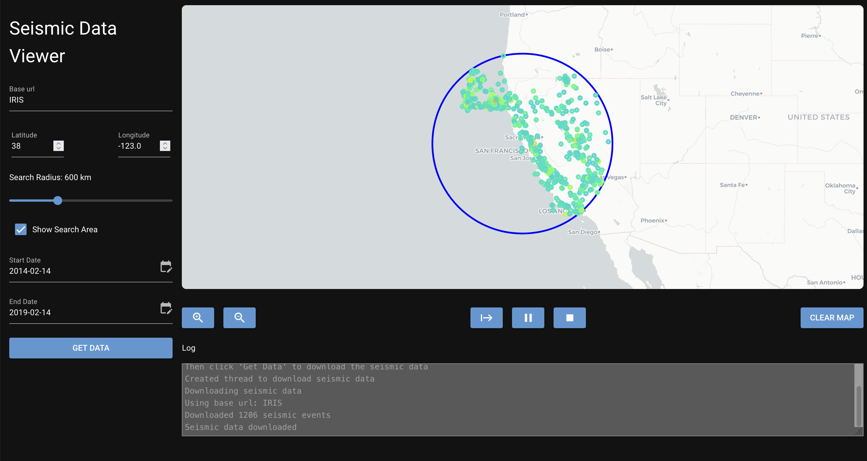
As we can see, the seismic events are mostly distributed around the fault line near San Francisco, as expected.
Such tools can be used to track the seismic activity in the area and to get a fast overview of the distribution of the seismic events.
Conclusion
This small project turned out to be a great way to visualise the seismic data to get a better understanding of the distribution of the seismic events around the fault lines. I’ve also refreshed my knowledge of the Leaflet library and learned about the nicegui module.
The source code for this project will be available on my GitHub page soon, I want to implement some more features before I publish it.